Friday, October 14, 2016

Module 7: Video Review

1. For each video list/discuss the key concepts you learned.
Prairie Style (Frank Lloyd Wright)
  • The Prairie style is derived from the Midwest Prairies near Chicago where he design many of his early single family homes
  • Many flat lines/bands were used in his design with natural color
  • Wright moved the fireplace to the center of the house, allowing windows to bring in more light, lower ceilings focus on the horizontal aspects of his design
  • Prairie style has been used by Wright to imitate the land around the house; the home on the hill emulates the slope with flowing rooms and open floor plans
  • Windows as walls opens the home up to nature and reduces the barrier between the too
  • Glass skylights allow for levels to the ceiling and added space
Architecture: The Science of Design
  • New materials such as cement and steel allowed for new designs and applications for city structure
  • High rises are composed of super structure and sub structure
  • Sub structures have different techniques depending on the ground where the building is being built
  • Wind is extremely important when planning a structure, the sway can even move about a meter in distance
  • Models simulate the area around the buildings to calculate the weather constraints that will be imposed on the structure
  • Buildings with right angles and flat lines react poorly to wind
  • Energy consumption is extremely important according to high tech computers
  • Concrete is used to create beautiful and reliable structures
  • Concrete can be prefabricated and assembled
  • Reinforced concrete, pre-stressed concrete has made technological advances possible
  • It will not break abruptly, it will crack first; allowing for it to be repaired
  • Concrete can be poured underwater as well


2. How do the videos relate to the readings in the text?
These videos appeal to the aesthetic and scientific foundations of architecture. This is primarily covered in Chapter 13: Architecture. The chapter compares necessary conditions for engineering as well as an appeal to the eyes. The second video focused on the importance of materials when planning a structure. For example, the text expands on some of the terms mentioned in the video such as tensile strength; this refers to amount of stretching that a material can withstand. Such as the video, form follows function. The text relates in the use of Greek columns, Gothic flying buttresses, and Indian corbelled arches. There are many ways to create a safe, attractive structure and the importance lies within the foundation and frame. The addition and discovery of stronger materials allowed for bigger and more beautiful buildings. The text and video both stress the importance of reinforced concrete in modern architecture.

3. What is your opinion of the films? How do they add depth to understanding of Architecture?
I truly enjoyed both videos. I love Frank Lloyd Wright's houses. I think that he did a phenomenal job in integrating nature into his houses. This video added depth through its detailed analysis of what happens in the design stage of architecture. The second video added depth on the second aspect of architecture. The amount of technical, scientific research is even more important that the design. If a structure is not safe, then it will never be used regardless of how it looks. This video was important for showing how design has evolved based upon the improvement of design and materials used in the structures. 

4. Why did you choose the films that you watched?
I chose the first video because of the Frank Lloyd Wright house in Buffalo. I've known about him since I was a child when I wanted to become an architect. The second video was chosen because before becoming an architect, I planned to get an engineering degree. I loved the math, but did not want to continue the science classes. This is why those videos appealed to me. 

Saturday, October 8, 2016

Module 6: Video Review

1. For each video list/discuss the key concepts you learned.
Through the Eyes of the Sculptor:
I did not know so much about the quarries. The process is quite impressive! The carver mentioned how it can be cut basically as easily as wood. That was crazy to hear!
I also learned quite a bit about how limestone restoration projects are done. The old carvings are molded and then the new sculptor attempts to "copy" the molded carving onto fresh limestone.
It is interesting to see the two Italian sculptors teach people how to work as sculptors. The way they do it to insure that everyone is participating, learning, and making progress is fantastic.
I was unaware that marble was a product of limestone actually.
The amount of measuring during the carving process is as important as it is to the final product. The plaster molds are invaluable because they can be stored and reused years later. They are cheap and can be used to make sculptures of any proportion regardless of the mold size.
Sculpting is such a fragile form of art. You cannot put back what you take off when carving. It is a beautiful type of art. 
Glass and Ceramics:
Learning about the process of which glass is made is interesting because of its wide use of society. Watching glass blowing and shaping is absolutely phenomenal. The glass must be fired multiple times in order to withstand shock of different temperatures.
Special paint is used to stain class that is not already color. It will adhere to the glass, while still remaining transparent. Models are made 1/10 of the size when working to insure that the lighting within shows the desired product before the full size is made.
Molds are generally made of plaster. The final firing is what with determine the qualities of the ceramics. Glazing is a coating that water proofs the ceramic and gives it a shiny finish. The glaze can also be a way to add color.
Glass is continuously being utilized more and more in architecture. A coating added to glass is able to function in many ways such as temperature differences and sound waves. Aesthetics and safety reasons are just other ways that glass serves modern day society.
2. How do the videos relate to the readings in the text?
The first video that I mentioned correlates well with Chapter 11. The use of sculptures and installation is mentioned in this chapter. The book states the additive processes of modeling and assembling. It differentiates these two from carving--which is a subtractive process. This is because it uses a large piece of  material and parts are taken off in order to display a work of art. Casting uses molds and super heated metals to form a final work. Assembling is mentioned in the book as well as with the marble human figures in the video. 
The next chapter correlates with the Glass and Ceramics video. The book notes how clay and glass have been used for centuries in everyday life and in aesthetic ways. This varies from stained glass and painted pottery--which was also shown in the video. The book expands on these and includes metal, wood, fiber, ivory, jade, and lacquer as well. 
The emphasis on architecture is also strongly related. They mix aesthetic needs as well as needs for efficiency and safety.
3. What is your opinion of the films? How do they add depth to understanding of the topics: Sculpture, Installation, and Craft?
Both videos for this module were very well done. An updated one would be nice regarding the use of glass in architecture now in 2016. The videos added so much to the understanding because of the way they were able to explain the process for the above topics. It is one thing to read and see pictures in a book, but it is invaluable to have a video with a narrator to help the reader in comprehending how the artist begins, works on, and finishes sculptures, installations, and crafts.

Module 6: Art Blog Reviews

1. Hyperlink the Blogs you reviewed into your Blog
I had to go up a few people on the list to find a person that I could review both projects. Then I chose a second person after.
http://laurenroetzerartblog.blogspot.com/
http://darrenyoung21.blogspot.com/
2. When looking at Project #1: (Elements and Principles), did you agree with the element or principle the artist listed with the images? Did you see other elements and principles in the images?
I did agree with the elements and principles that I saw. I was able to tell that a good portion of the photos could actually have been used for more than just one element/principle.
3. When looking at Project #2: Where there any images in the Peer Blogs the same as your own? If yes, what were they? Where the reasons the image was selected the same or different as your own?
Yes, The Marvelous Sauce and La Source De La Loue were paintings that I found in other projects in addition to my own. Some of the reasons were similar; for example the detail of the work or the mysteriousness of the setting. One student went farther with looking into political undertones where I was just admiring the impeccable detail the artist put into the work.
4. Where there any images that your Peers selected that pique your interest now? If yes, what are they and what is your connection with them? What would you want to know about them?
I saw Under a Cloud at the museum. It wasn't until my peer used it in her project that I became so fascinated with it. The connection to depression was important. Some members of my family struggle with it and once I made the personal connection, the work really meant a lot to me. I would like to know more about the artist's relationship with her mother.
5. What do you think about  the process of reading your peers reflection? Do you find this to be a valuable in your learning?
The process is rewarding. Not everyone perceives things the same way that you do. Reading what others used in their projects and why opened up new doors for me. I enjoyed seeing what other people my age thought of while completing these projects. It is definitely a valuable teaching tool for us instead of just answering questions out of a book each week.
6. Check your Blog and read comments posted by your Peers. Do you find their comments helpful?
The comments were extremely helpful. It was nice to see what people think about your own work. My comments did agree with what I did and even if they did not, I would still appreciate the critiques!

Saturday, October 1, 2016

Logo


The final logo is on the left page in the center. The red ribbon with the blue background crest is my final choice.

1. Discuss what you thought about creating your logo.
I thought about what characteristics, colors, and things represent me. I focused on my favorite things and/or passions: hockey, playing goalie, and coffee. 
2. Describe the process: creative thinking skills and ideas you used in the logo creation.
I was thinking about using colors to have my design stand out. I was debating on college colors, professional team colors, and national colors. I wanted to use objects or symbols that would be recognizable. I thought of a crest because it is like the NHL logo (hockey influence) and a badge (protective influence). As a goalie, I am a very defensive minded person and a badge styled crest symbolizes security and protection.
3. What was the most important discovery you made in the creation of your logo?
Refining the logo design was the most important. The process of brainstorming sketches and deciding on a direction to continue in is paramount when designing a logo. Once I had a general idea, then it turned into changing the details in order to get the best version of what I wanted.
4. What is the most important information you learned from watching the videos, powerpoint, and reading material  for this project? What is your opinion of the videos?
I learned about the history of lettering, symbols, and the use of artistic elements in ancient society.  The most important aspect of the reading is the emphasis that it puts on contemplating and brainstorming. This is such an extremely important portion of the logo design stage. It was interesting to see how those ideas were translated to modern day logos. The videos were informative, but not as interesting as the reading. 

Gallery Visit #1

A.) Which artworks make an impact or impression on me? Why?
 Jehan Georges Vibert, The Marvelous Sauce. Oil on wood panel.1890.
This painting is absolutely amazing. The reason it made an impression on me was its attention to detail and realism. The lighting, physical features, and materials within the painting look authentic. The painting looks like a glossy photograph. 


 Albert Bierstadt. The Marina Piccola. Oil on canvas. 1859.
I stood in front of this painting for minutes on end. This painting gave me the impression of serenity and freedom. The sun breaking through the clouds and hitting the water out on the horizo. I thoroughly enjoyed this painting by Bierstadt


B.) Which artworks do I feel a connection with? Why?
Claude Monet. Chemin de halage a Argenteuil. Oil on canvas. 1875-76.
I felt a connection to this painting for a couple of reasons. My dad taught me about Monet as a child. I reminisced about those days as I looked at this painting. The other connection was the snowy bank by the water. It is similar to parks/waterways in and around Buffalo. It feels like home.


Joseph Kosuth. One and Eight--a Description [Blue]. Blue neon tubing. 1965.'
Since I was a child, I always loved the city atmosphere and neon lights. The piece is obviously bright and grabs your attention. What I enjoy about it is how humorous and blunt the words are that Kosuth made such as "letters" and "light." The satire and glow is what I connected to the urban lifestyle and my own personality.


C.) Which artworks would I like to know more about? Why?
Camille Pissarro. Paysans dans les champs, Eragny. Oil on canvas. 1890.
I wanted to know more about this because I wanted to understand the backstory. It is a French painting, but I am interested to know more about how people were treated in France compared to America at this point in history.


Tara Donovan Untitled (Mylar). Mylar and glue. 2007.
Donovan's work stood out to me and was just fascinating. Her work filled the display room. I wanted to learn more about it because I don't think that I have ever seen Mylar before. The material perplexed me and I wanted to learn more about it.

Thursday, September 22, 2016

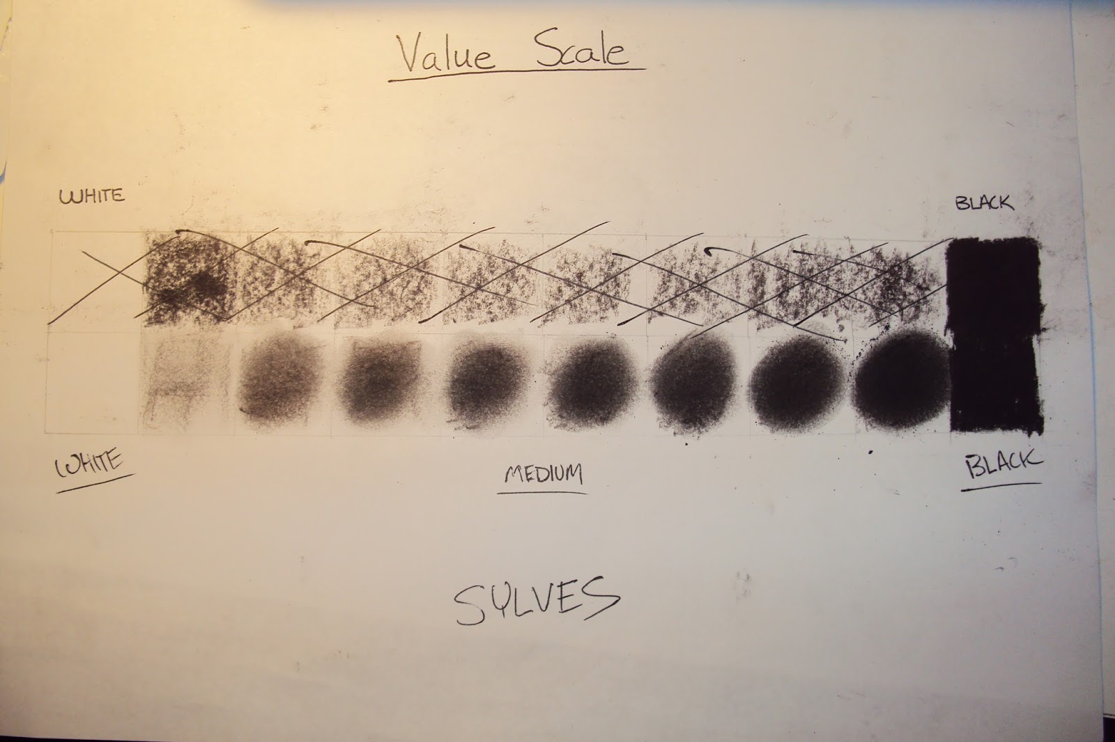
Module 4: Value Scale and Color Wheel

1. Discuss what you thought about creating the Value Scale and Color Wheel.
The making of the value scale and color wheel was quite simple. It is also pretty easy to mess up as well. The top section of my value scale is crossed out because I put too much pressure on the charcoal.
2. Which media did you enjoy working with the best and why?
I enjoyed the charcoal the most. It takes focus in order to get the result that you are expecting. Smearing the charcoal to even it out was fun...and messy.
3. What was the most important discovery in the creation of these studies?
Discovering how to plan ahead in art was crucial to the assignment. Art is a process and it can be disastrous to get ahead of yourself when working.
4. What is the most important information you learned from watching the videos for this project? What is your opinion of the videos?
The videos were informative. I knew about cyan, magenta, and yellow because my dad was in broadcasting and explained that to me as a child. The videos were useful in explaining why red, yellow, and blue are not the true primary colors; this is because they do not mix to black.

Sunday, September 18, 2016

Project #1: Elements and Principles

This project reminded me of my passion for photography. My dad taught me so much about it when I was a child. As I grew older, I put this pastime of mine on the back burner. It was convenient that some of my favorite photos from my vacation to the Adirondacks in 2013 fit the requirements for this project! I took the rest of the local photos in the rainstorm yesterday.


http://s61.photobucket.com/user/imsgoalie94/library/Art%20Project%201%20-%20Elements%20and%20Principles


imsgoalie94's Art Project 1 - Elements and Principles album on Photobucket