Tuesday, December 13, 2016

MOD 16 Blog

1. What were you expectations for this course and where they met?
My expectations for the course were met. I was able to learn more about art fundamentals. This gave me a better unit of analysis when appreciating art.
2. Now that you've been through this course, What is art? How would you define it now compared to your intial posting?
I would take a similar stance that I did in my initial posting. Art is a form of expression. It can represent tactile or imaginary ideas. It uses a range of mediums and can be presented in numerous ways. Art can basically be almost anything that can be enjoyed, thought provoking, and transcended through time.
3. Who was your favorite artist in your original posting and who is your favorite visual artist now? If there is a difference, why do you think so? If you have the same favorite artist, why do you think so?
 I do not believe I put a favorite artist. My favorite artist is Monet and it has not changed. I love that style, I am fascinated with it.
4. Now that you've completed this course, how do you feel about taking an online course? Is your answer the same as it was in your first posting? How is it the same or different?
My answer is the same. It works great with my busy hockey schedule. 

Sunday, December 11, 2016

Mod 15 Blog - Self Portrait blog

    Yoo, Geun Taek, 1999, "Self Portrait," Black-ink and conte, gouache, powder of white on korean paper
   Vincent van Gogh, 1889, "Self Portrait," oil on canvas
    Edvard Munch, 1904, "Self Portrait with Brushes, 


1. Why did you select the inspiration pieces?

I really enjoyed the quick brushstrokes and style.


2. Why did you select the media to create your self-portrait?


It was easy to fix any mistakes. Pencil was the best medium for the project.

3. What challenges did you face in creating your self-portrait and how did you overcome them?


4. How does this piece represent you?


This is me with one of my favorite hockey memories. My team won the Sutherland Cup in the GOJHL.

5. What elements and principles of art did you apply in this work?


Lines and emphasis. Lines create the work, the emphasis on the trophy, face, and logo illustrate the important pieces of the work. 

6. Did you enjoy working on this project?


I am not good at drawing, but choosing a good photo to recreate helped me enjoy it a bit more.


7. What do you think of your final artwork?


It represents me and the moment the way that I wanted it too. 

I used Google Art for the photos of the famous artists self portraits.

Sunday, December 4, 2016

Art Curation Reflection Blog

Reflection:

The process was much more involved that I truly ever thought. The amount of effort and careful consideration that art curators must do when creating an exhibit is paramount in creating a successful exhibition. Every little detail matters whether it involves the space, lighting, choices of artworks, organization of art, etc.

Learning about this got me pretty excited to do this project. I bounced around with a few ideas for my theme. The first was urban lifestyle in the 20th century. I decided to go with a war theme and use it to track artist's depictions of war over the past centuries. The artworks illustrated how there are a few different ways that artists generally depict war scenes:

  1. Romanticized
  2. Brutal & Bloody
  3. Dark & Desperate
  4. Energetic Propaganda 
The way that war is depicted still carries the moral weight with it. I am happy that I chose to do this theme because it was quite enlightening 

Thursday, December 1, 2016

Module 13/14: Video Blog Review

1. For each video list/discuss the key concepts you learned.
Lowdown on Lowbrow:
  • Lowbrow is a new take on surrealism
  • Lowbrow is not surrealism 
  • Lowbrow takes guts and is all inclusive
  • Found in sign paintings and advertising
  • Lowbrow came around the early 60's especially in South California
  • Drawing was a big deal, understand the basics
  • More open to women that an other movement in art history
  • Lowbrow and comic books share a common thread
New Tate Modern:
  • Tate Modern in England has brought back the culture to the old industrial city
  • Holds modern and contemporary art
  • Divided the art world and created much controversy
  • The young tend to struggle with contemporary art, sometimes it's the exact opposite
  • Tate is the most visited contemporary museum in the world
  • Vanity is culturally changing within society 
  • Tate includes performance art, pushes the boundaries of what is considered art
  • Art is always evolving
An Acquiring Mind:
  • Sometimes, areas of collection must be reviewed and augmented
  • Collections may even take pride in including art this is disliked
  • Photography is also included 
  • Much goes into the selection of a collection for a gallery
  • Sculptures are also considered for how they are staged
  • Curators will spent an unbelievable sum of money to obtain works that they consider are needed for their collection
  • Some acquisitions can be varied or thematic where each collection within a gallery creates a different change based upon geography, timeline, themes, etc.


2. Do the videos relate to the creation of your Art Exhibition project? If yes, explain how. If no, explain why not.

The last video applies to my project. It helps me to understand the importance of a theme and how it can alter the viewer's interpretation of the work. The Lowbrow video helped me understand what creates a following for a particular style of art. This can be considered when deciding on a theme for the project. The second video aids in deciding what route to take on the type of art that I want to choose. Some viewers may not enjoy what you put in your collection. You have to decide on what matters the most to you and what you want your collection to do for the viewer.

3. What is your opinion of the films? Do they add depth to understanding of the art concepts you practiced while creating your curation project?
I enjoyed the Lowbrow video the most. It was very interesting and actually quite fun. The Tate video was also interesting. The last video was by far my least favorite, but it did help me with the art project the most. The Tate video also helped, but I was more interested in the old building rather than the artwork. 

Saturday, November 19, 2016

Module 12: Video Blog Review

1. Explain why you selected each of the TWO videos you choose from the selection listed above.
I have been of fan of Andy Warhol's work. Choosing that video was easy. The subject of uncertainty in art intrigued me so I made that my second choice. 
2. For each video list/discuss the key concepts you learned.
Andy Warhol:
  • Warhol is the leader in Pop Art
  • He died in 1986, he always to be a tap dancer
  • He worked in advertising first
  • Monroe's face made Warhol famous
  • He used screen printing
  • Also published his own magazine 
  • Silk screen can take away or emphasize parts of the human face 
  • Warhol took the death of others and made money off of it
  • Warhol used death as a main theme over and over

Uncertainty:
  • It is a burning issue of humanity 
  • Society is defined by change in modern society
  • Reality is always collisions of different points of view
  • Abstract art comes across differently to non-artists
  • It really just tests out modern changes in societies in what a person can understand or think about it
  • You must do something, but you are guided by nothing


2. How do the videos relate to the readings in the text?
The videos relate to the text quite well. The videos expand on the text. It is very apparent how the ideas behind art truly changed during the 20th century. The values of art and the mindsets of artists were changed by how society would react. Nothing would be quite the same. The use of screen printing and Pop Art represented the culture. Interpretations of Abstract art depict the changing principles underlying society by what someone can see in an abstract work.
3. What is your opinion of the films? How do they add depth to understanding of the readings and art concepts?
I said this before, but these might have been my two favorite videos. They added depth in ways that the other videos could not previously do. The reason for this is quite strange; the music in the videos made it very easy to get in tune and dialed into the purpose. I could truly understand what was in question. 


Sunday, November 13, 2016

Art Gallery Visit #2

Step 1: The Exhibition
Questions about the exhibit:

1. What is the title of the exhibit?
There were a couple of exhibits at the Burchfield Penney Art Gallery including: The Birthday Party: a Community of Artists, HERE!, and My First Exhibition: 50 Years with Charles E. Burchfield. 

2. What is the theme of the exhibition?
The Birthday Party was centered on a group of artists that knew each other and their works. HERE! was work by people of Buffalo or of Buffalo. The last one was Burchfield's nature artworks. 

Step 2: The Gallery
Questions about the physical space:
1. What type of lighting is used?
Birthday Party exhibit was very dim with track lighting focused on the artworks only. HERE! and the Burchfield exhibit were much brighter.

2. What colors are used on the walls?
The gallery used white, light gray, dark gray, and even a sage green on the walls.

3. What materials are used in the interior architecture of the space?
Stainless steel and wood were prevalent throughout the gallery. The entire gallery had a wood floor. 

4. How is the movement of the viewer through the gallery space?
The gallery pulled the viewer through the space by large lettering on the walls to draw the viewer towards it. After that, the shape of the rooms and partition walls guided the viewer as the viewer transitioned from one artwork to the next.

Step 3: The Artwork
Questions about the artwork:

1. How are the artworks organized?
Some of the art was placed near each other and could almost be viewed simultaneously. Other parts of the gallery had the work spaced out and allowed the viewer to focus in on one piece.

2. How are the artworks similar?
The Birthday Party all had lots of people in many of the works. HERE! all dealt with Buffalo or the people of Buffalo. Burchfield's work is centered around nature and psychedelic colors.

3. How are the artworks different?
Some of the art was photography, paintings, or sculptures. They differed in technique, colors, lighting, and size.
4. How are the artworks framed?
Some were wrapped around wood frames. Others had very minimal, modern frames; contrasting ones had ornate, intricate frames.
5. How are the artworks identified and labeled?
They are identified to the right by a small white card providing the title, artist, date, type of art, and how it was acquired.
6. What is the proximity of the artwork to each other?
This differed throughout the gallery. Some walls only had one painting with the corresponding sketches. Other walls had artworks spread by only a few inches or couple of feet. 

Art Criticism Exercise:

Artwork #1

Walter R Garver, Broadway, 1970, oil on board

1.   Be receptive - Keep an open mind.  Look for what is good.  No put-downs allowed.

2.   Description – Describe what you see.  (subject matter)?

There is a woman walking on the sidewalk. She is walking in front of a building with large windows, possibly a store. It looks like it might be closed or vacant.

3.   Formal analysis – (form)  What principles and elements were used and how are they used?


Color is evident by the detail it adds to the painting. Texture is shown by the sidewalk and paint cracks. Movement by the angle of the lines as she is walking away from the viewer.

4.  Bracketing - Is there anything in or about this work that reminds you of anything else? Do you see any symbols, metaphors, or allegories?  (iconography)

The building looks vacant and alone, much like the woman in the painting.


5.  Interpretation - (content)  What do you think the artist was trying to say?
Buffalo was in a decline at this time in history. The woman much represents the city, alone and only with her shadow of what she once used to be. 

Artwork #2

Virginia Cuthbert, Parc Monceau--Pris, 1976-1977, oil on canvas

 1.   Be receptive - Keep an open mind.  Look for what is good.  No put-downs allowed.

2.   Description – Describe what you see.  (subject matter)?

Large group of people in a park with some foliage near the walkway.

3.   Formal analysis – (form)  What principles and elements were used and how are they used?

Colors, lines, unity, and movement combine to bring the viewer through the work. The viewer notices the emphasis on the people while nature is blurred more.

4.  Bracketing - Is there anything in or about this work that reminds you of anything else? Do you see any symbols, metaphors, or allegories?  (iconography)

The people bring life to the frozen park, they are the warmth.

5.  Interpretation - (content)  What do you think the artist was trying to say?

Nature at times is very bitter and cold. The people of the community have the ability to bring an area back to life in such times.


Artwork #3

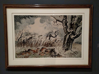
Charles E. Burchfield, November Storm, 1950, watercolor on paper

 1.   Be receptive - Keep an open mind.  Look for what is good.  No put-downs allowed.

2.   Description – Describe what you see.  (subject matter)?

There is a tree next to a field with a tree in the distance. The leaves are no longer on the branches and there is snow on the ground.

3.   Formal analysis – (form)  What principles and elements were used and how are they used?

Emphasis on the foreground tree is evident. Movement gives a sense of wind in the painting. Color is used to show the muted tones of a winter scene with the very dead landscape.

4.  Bracketing - Is there anything in or about this work that reminds you of anything else? Do you see any symbols, metaphors, or allegories?  (iconography)

The colors and brush strokes are muted and symbolizes the iciness of nature in a early winter storm. 

5.  Interpretation - (content)  What do you think the artist was trying to say?

The artist was trying to accurately depict a winter scene and capture the emotion behind it. 

What did you think of visiting the Gallery and purposefully looking at the exhibition from a different perspective - the physical space, the architecture, theme, etc.?

It really changed my viewing experience of the artwork. My perspective changed because I was not just only viewing the art, but how the gallery decided to display it. It is evident that the way the art is displayed, that the way the viewer will perceive the art will be altered.

Friday, November 11, 2016

Module 11: Video Review

1. Explain why you selected each of the TWO videos you choose from the selection listed above.
Expressionism and cubism appeal to me. I chose these videos in order to learn more about them in greater detail.

2. For each video list/discuss the key concepts you learned.
Expressionism:
  • In the past, expressionism caused outrage in addition to acclaim
  • Expressionism depicts emotion rather than just reality
  • Women were now shown in demonic and sexual ways in low-key ways
  • Expressionism can explain life to the viewer in way that art could not previously accomplish
  • Some paintings were referred to not even have a subject
  • They can forecast impending doom of social issues to wars
  • Placement of figures and brush strokes show much about the expressionism paintings
  • Textures also play a part of representing expressionism
Cubism:
  • Picasso was a leader of the movement
  • subjects are constructed and reconstructed
  • collage is sometimes part of the art and pattern of cubism
  • Titles of the work is extremely important to the work, even if it satirical 
  • View the style, not the content sometimes is a good way to view cubism


2. How do the videos relate to the readings in the text?
The videos went into better detail than the text; at least in regards to particular artist and communities. Examples of this include cubism with Picasso and the one painting of cubism of the Englishman in Moscow. The explanations of the art is phenomenal in the films compared to the text. The text is a bit more bland when talking about expressionism and cubism.

3. What is your opinion of the films? How do they add depth to understanding of the readings and art concepts?
These were my favorite films that I have watched so far--maybe tied with the architecture videos. These forms of art are so interesting and diverse. The films explained so much about particular artists and how the art transformed. They were fantastic.